best of
both
Little ray of sunshine.
Best of Both (aka B.O.B.) is a new little ray of sunshine in the dairy aisle. Glug it, pour it, splash it or dash it, safe in the knowledge that B.O.B has the fat of skimmed milk but is as tasty as semi-skimmed milk.
To distinguish BOB in the milk aisle, it’s packaged with a bright yellow top that sets it apart from the traditionally blue, green and red topped milk.
The aim was to develop a bright and bold campaign that would involve type interacting with the bottle. In order for the campaign to be launched the master image needed retouching.
It was incredibly tricky extending out the gradient of colours that already existed. I also worked out the best way of having the copy interacting with the master image.
Best of Both TVC
The bland town of Compromise is shaken to its core when Arla's new Best of Both milk arrives, in a new TV spot for the brand.
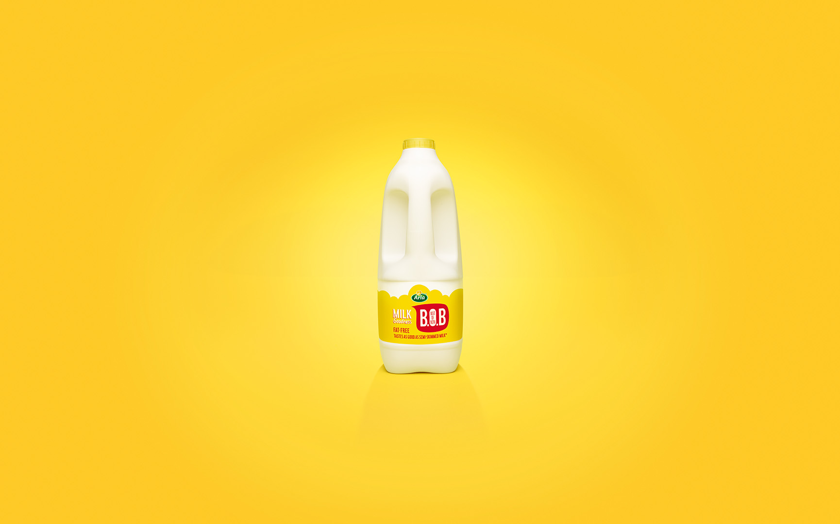
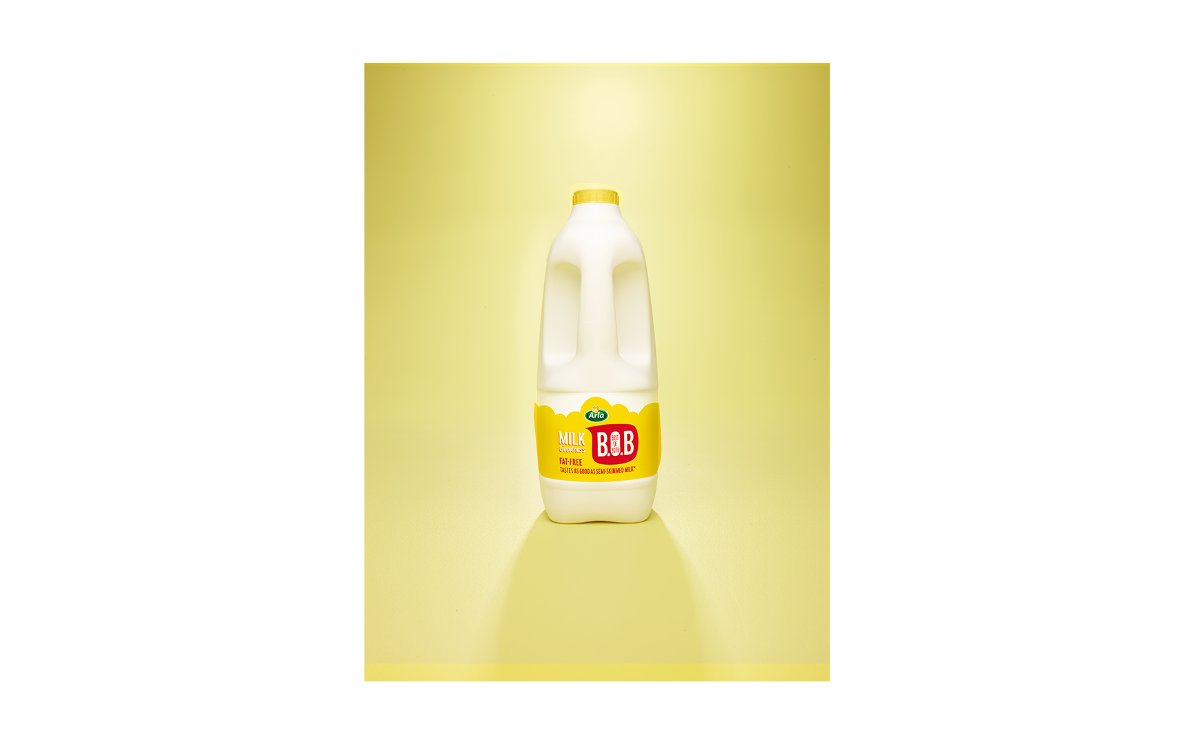
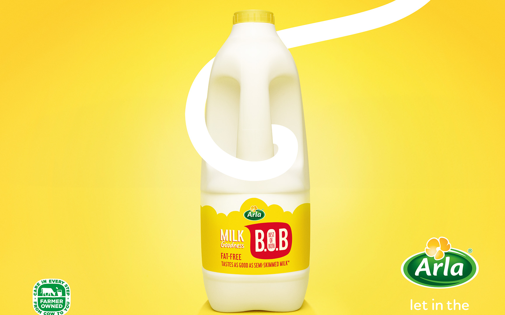
Master Image
The background of the master image required extensive retouching so that it could be applied to a wide range of media and outlets. The background image has been graded to a solid colour to allow it to be more adaptable.
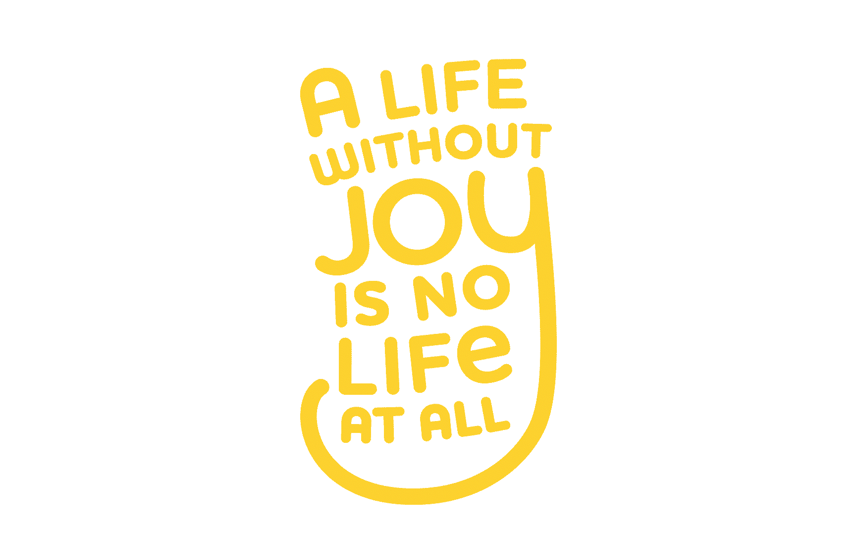


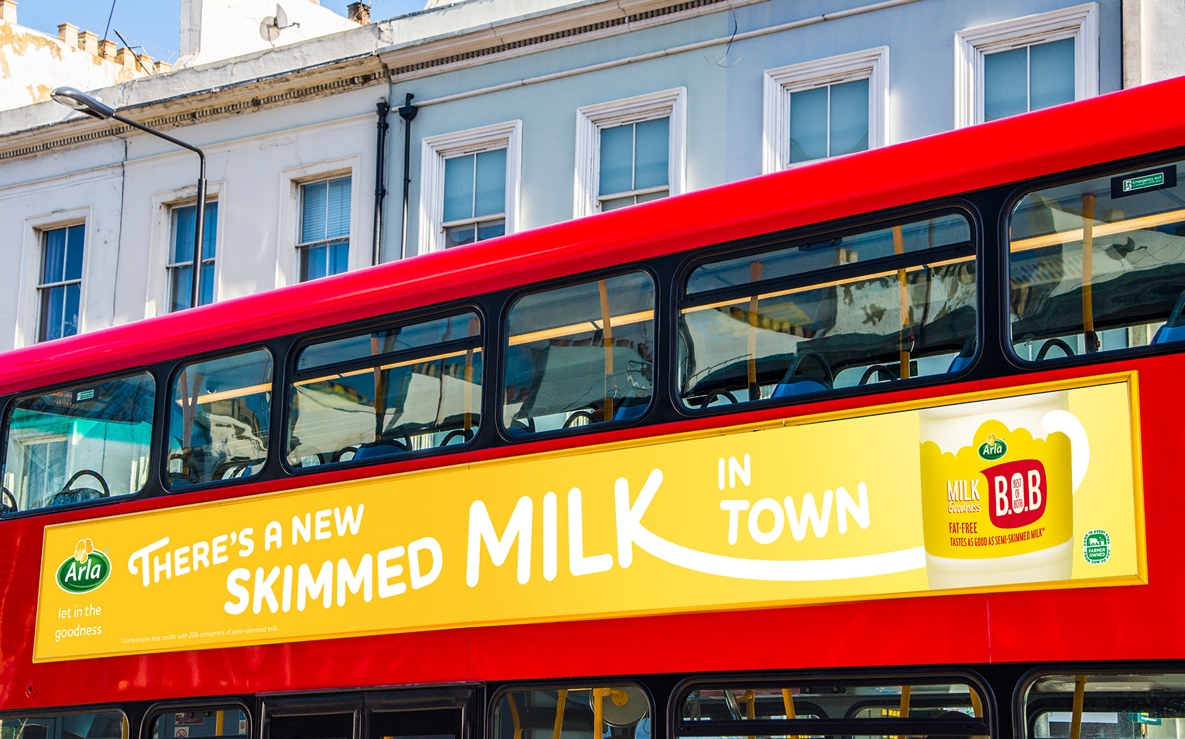
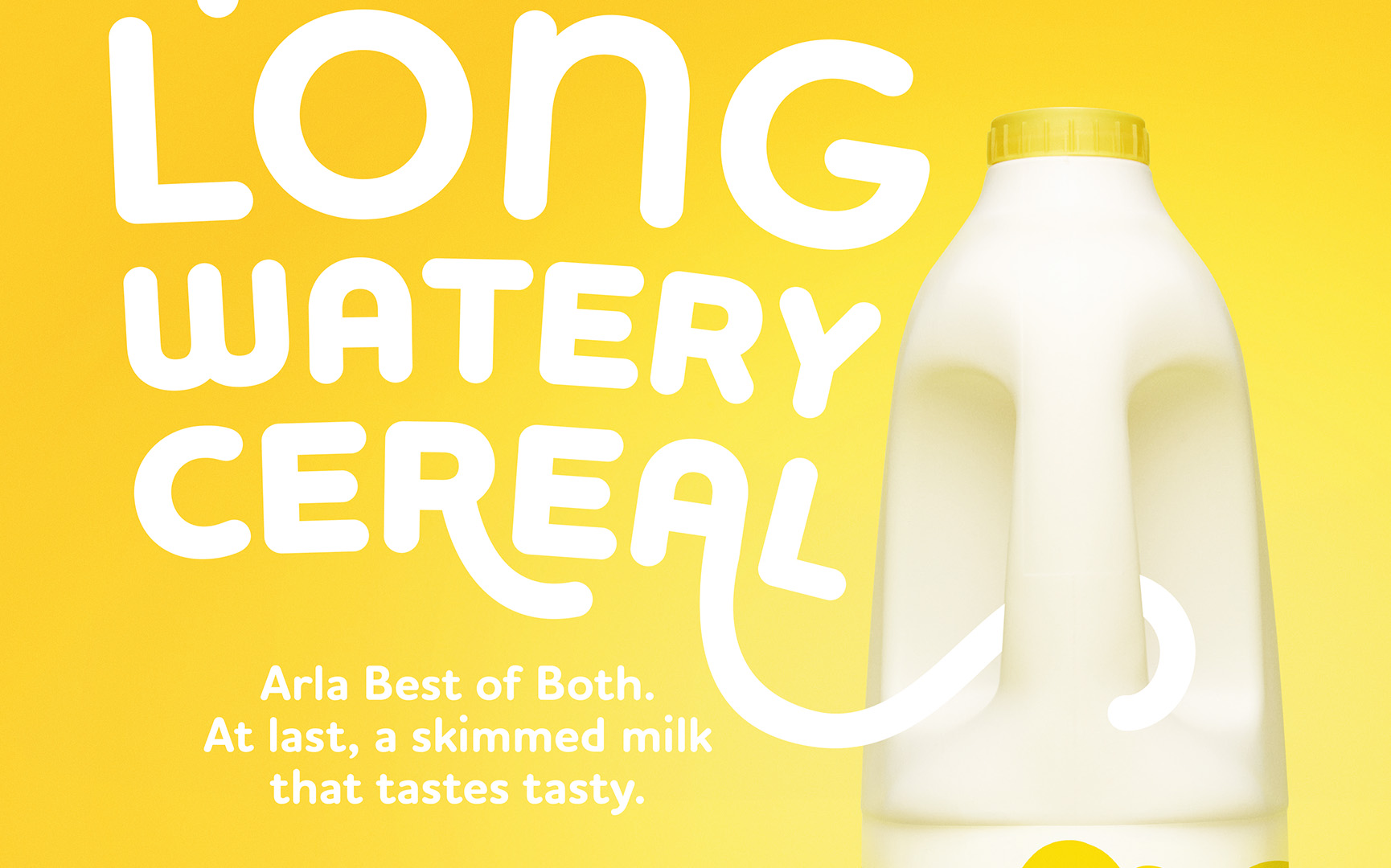
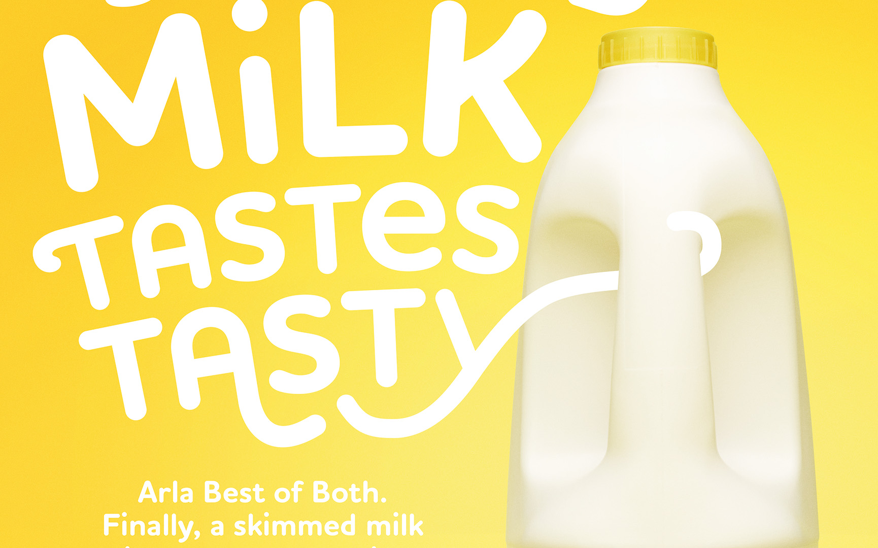
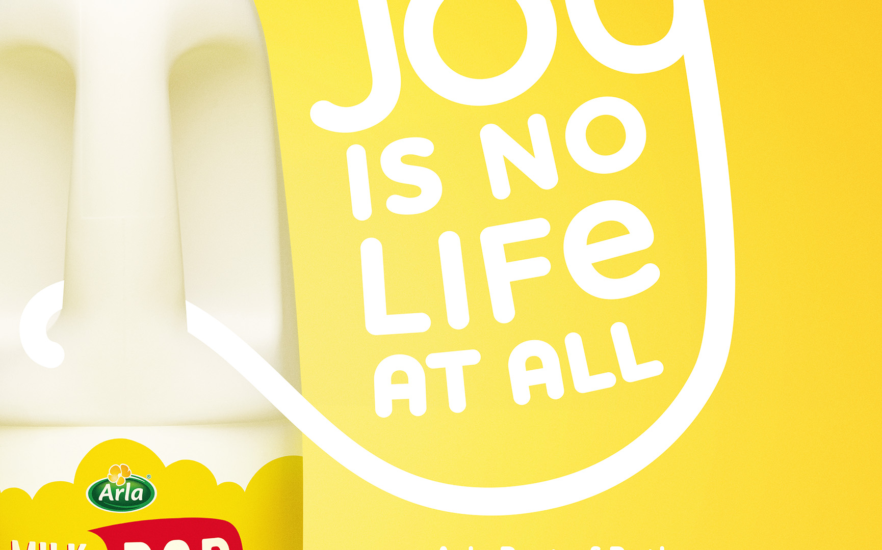
Type Interaction
The Arla typeface was required to interact with the bottle. On the left is an example of how this was done. The original type was set and then amended to have a more playful feel, and extended out to interact with the bottle.
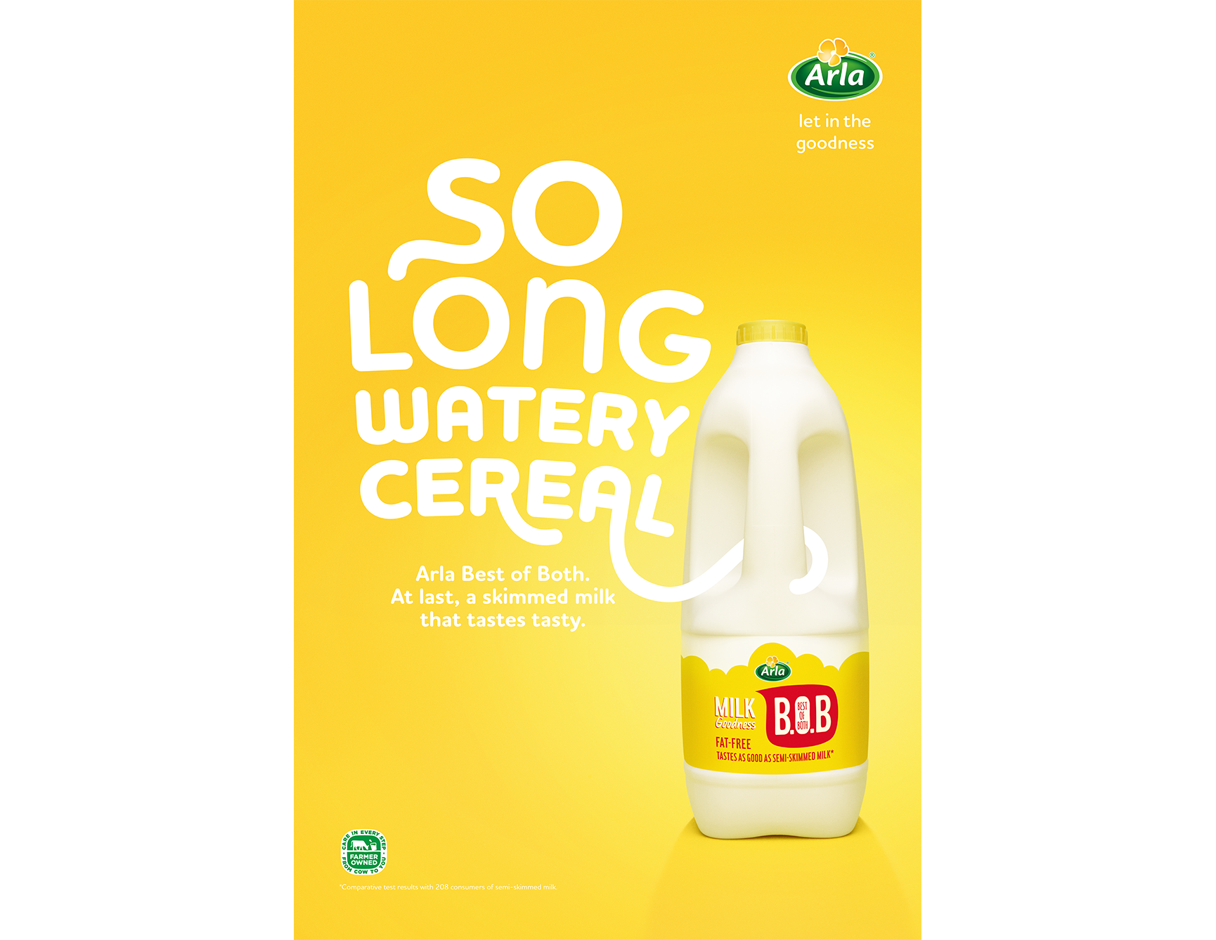
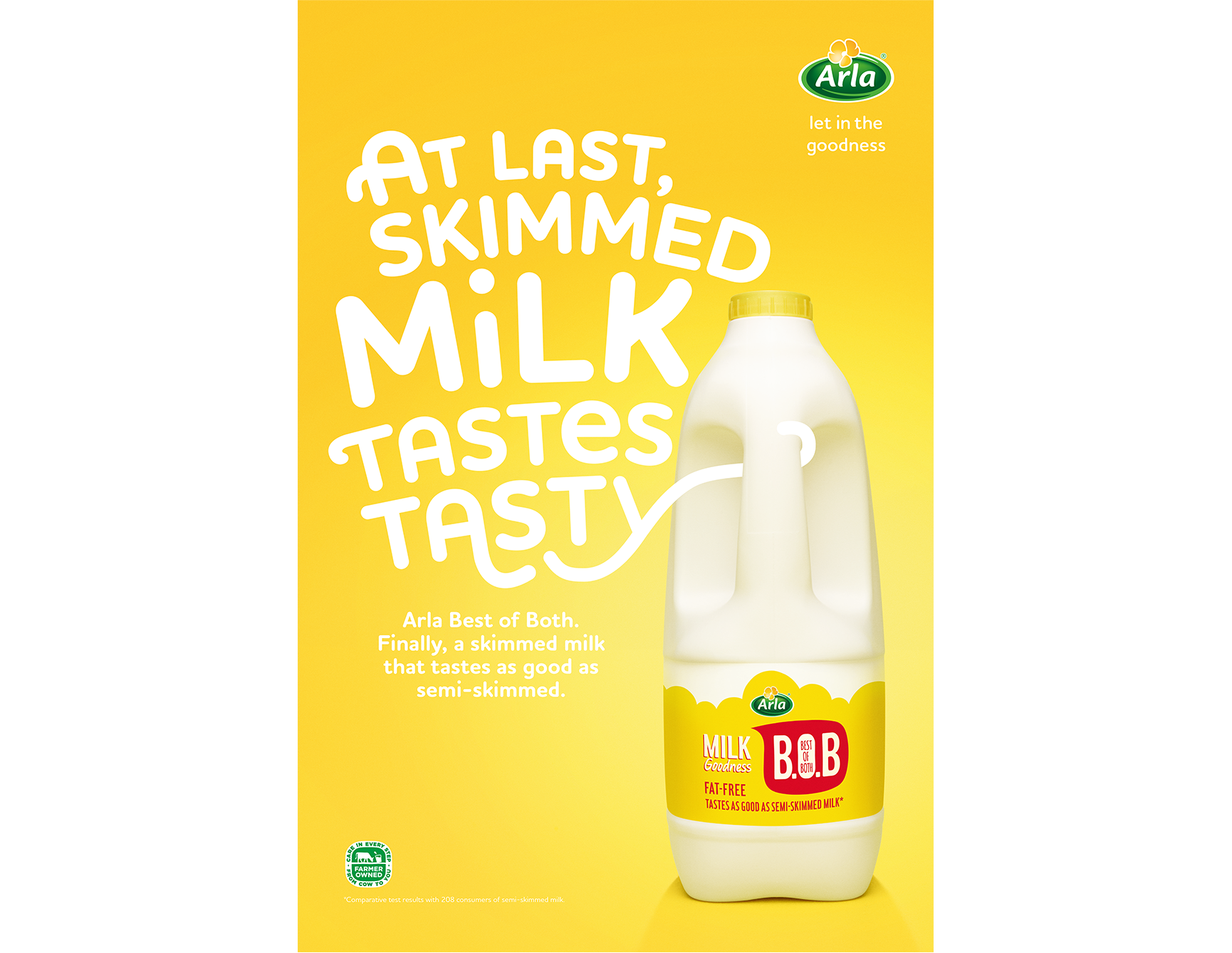
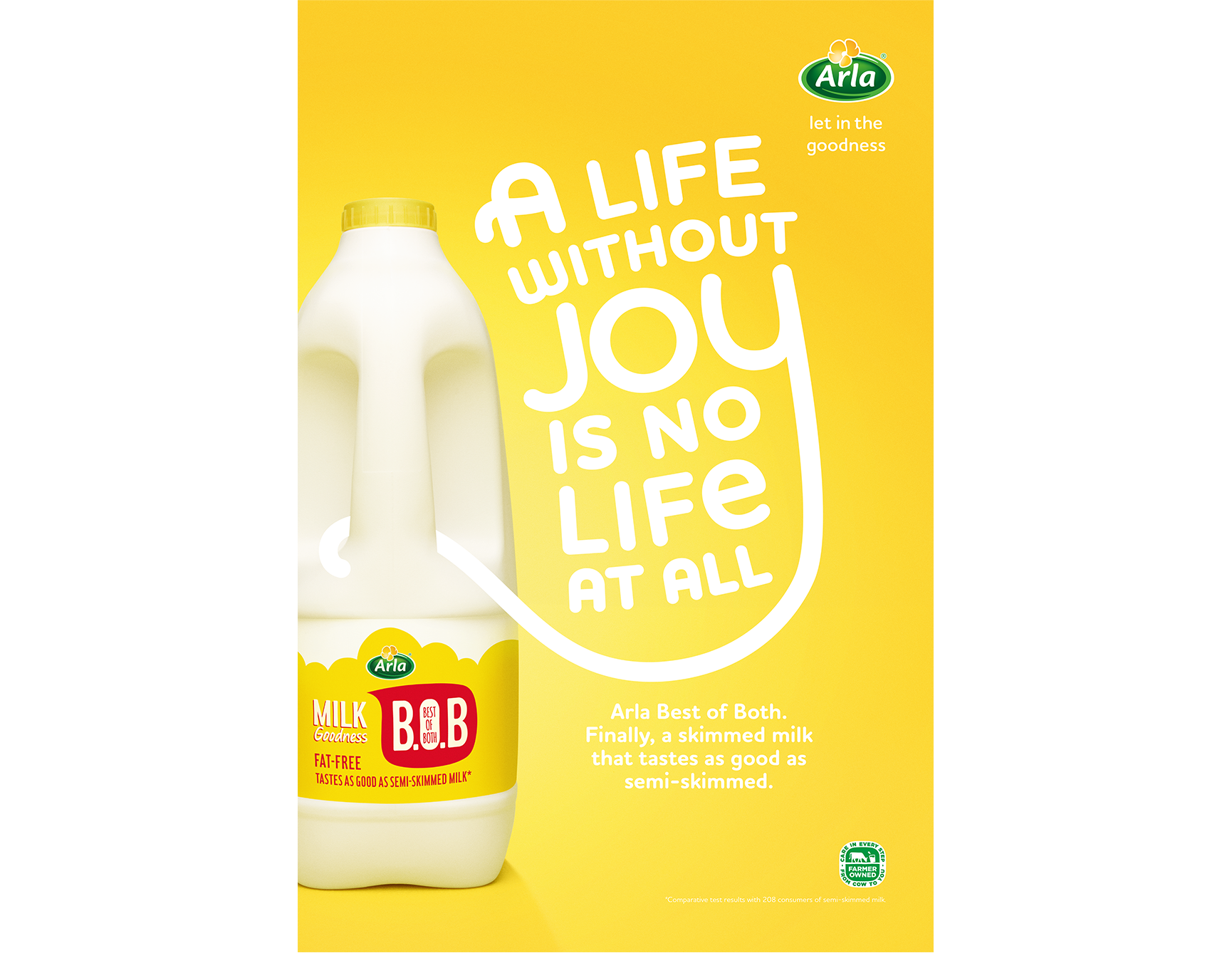
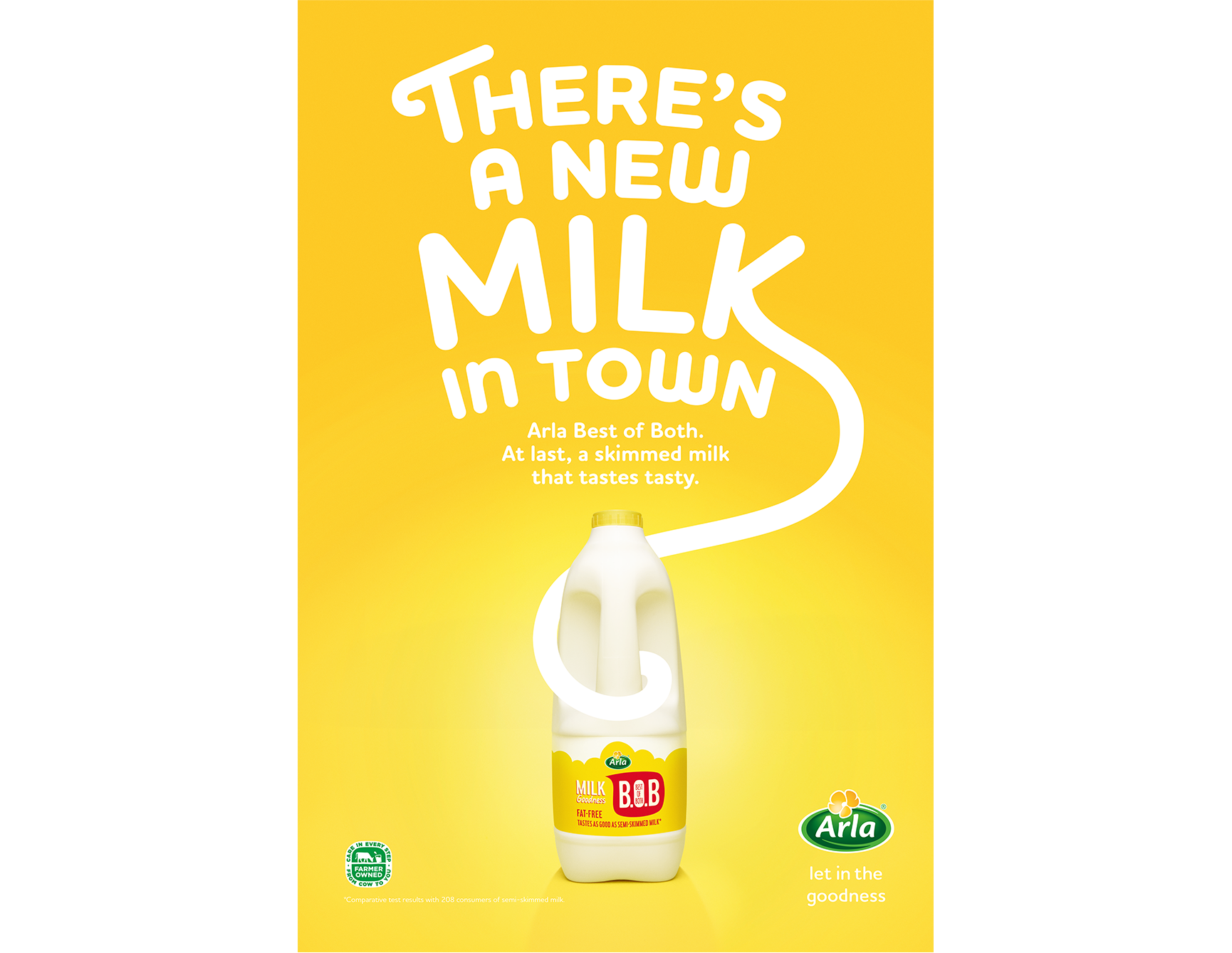
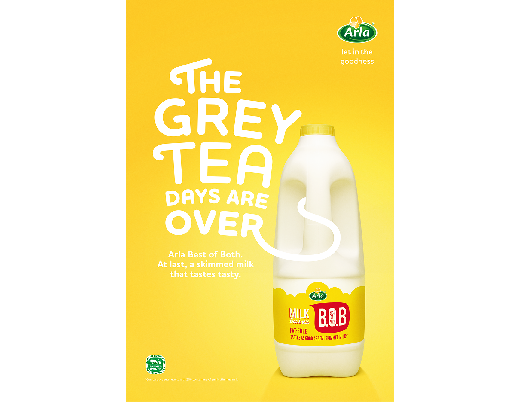
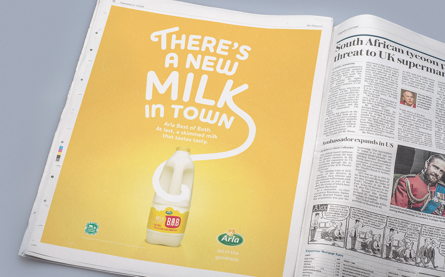
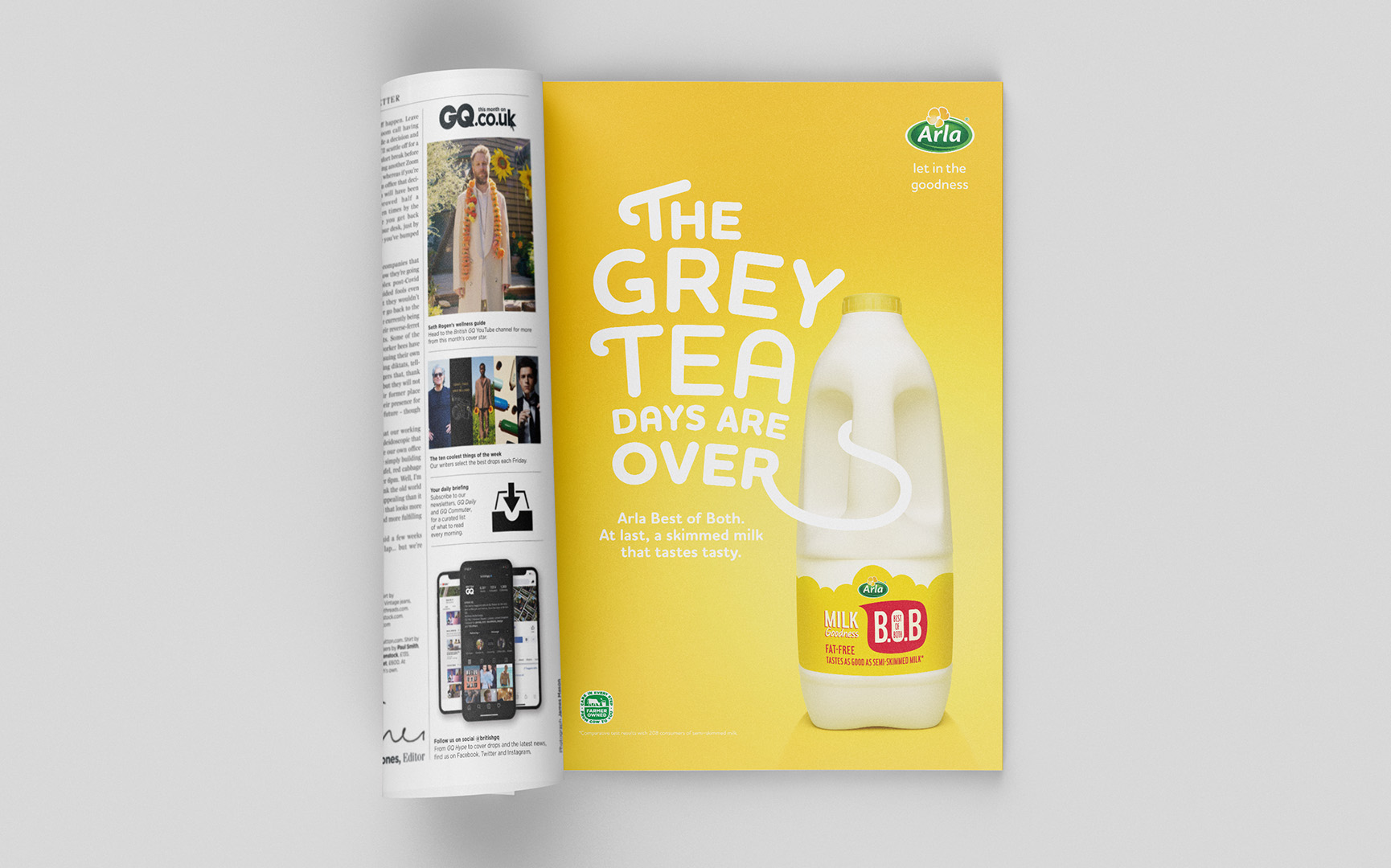
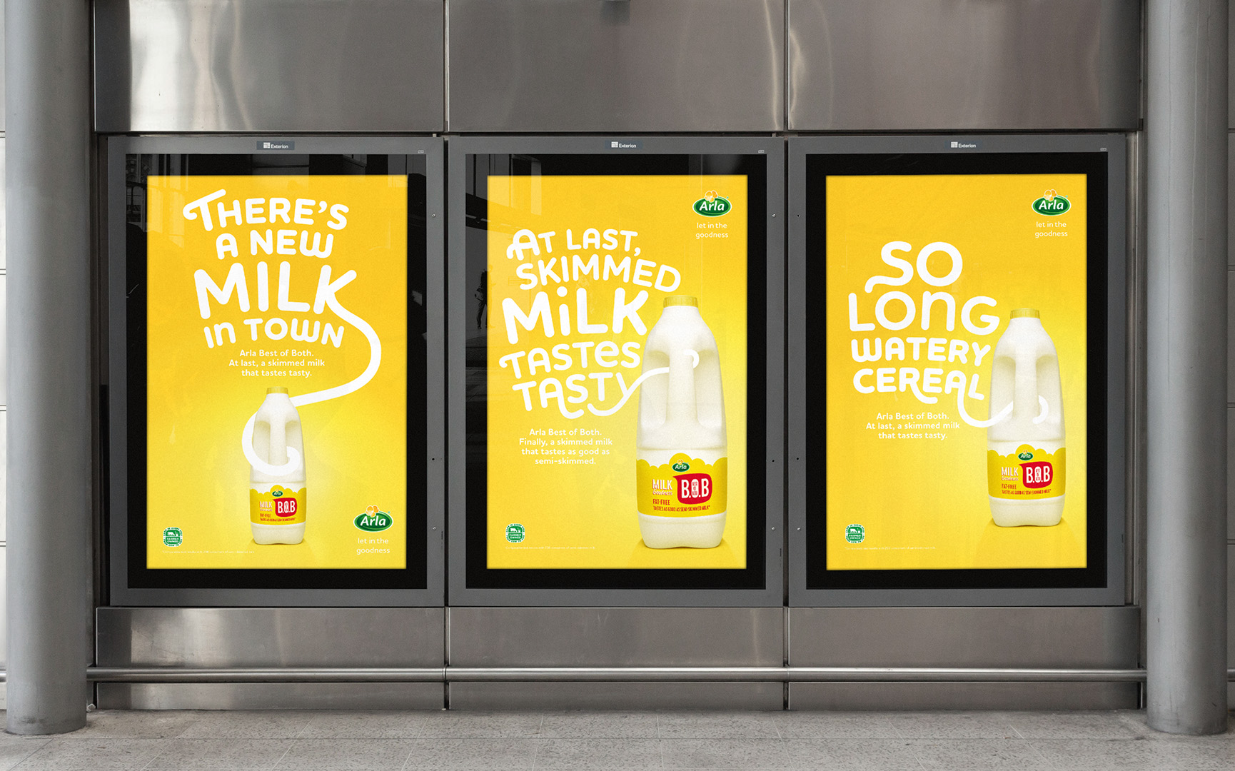
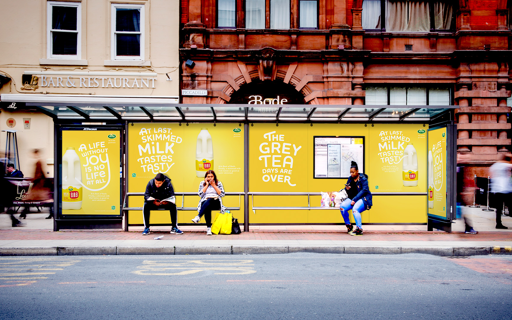
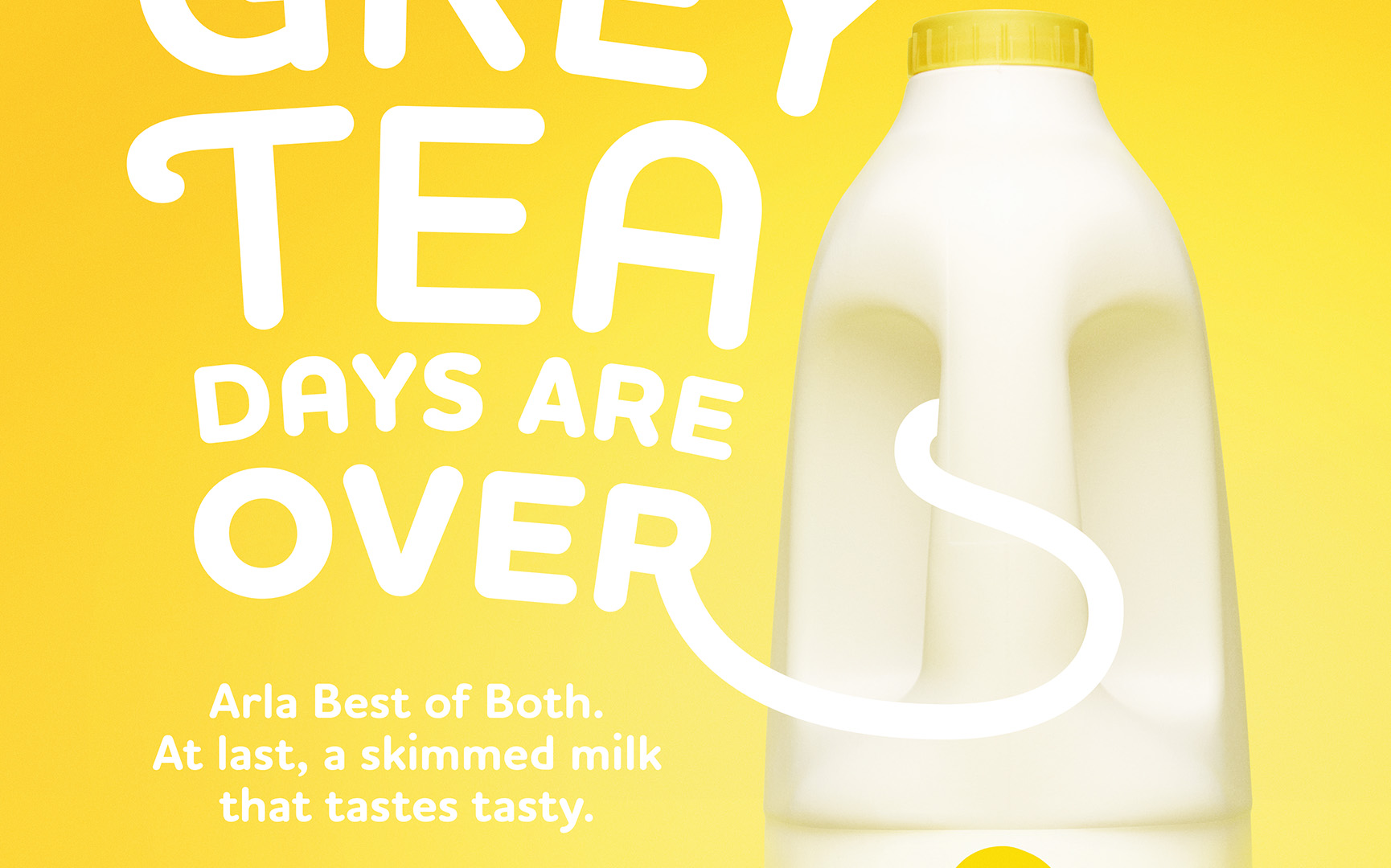
Portrait Layouts
These portrait layouts were created as part of the campaign, The feel of sunshine and joy really comes together with the colour scheme and type setting.
The type setting is not restricted to any guidelines. Rather the type plays around the layout and image.
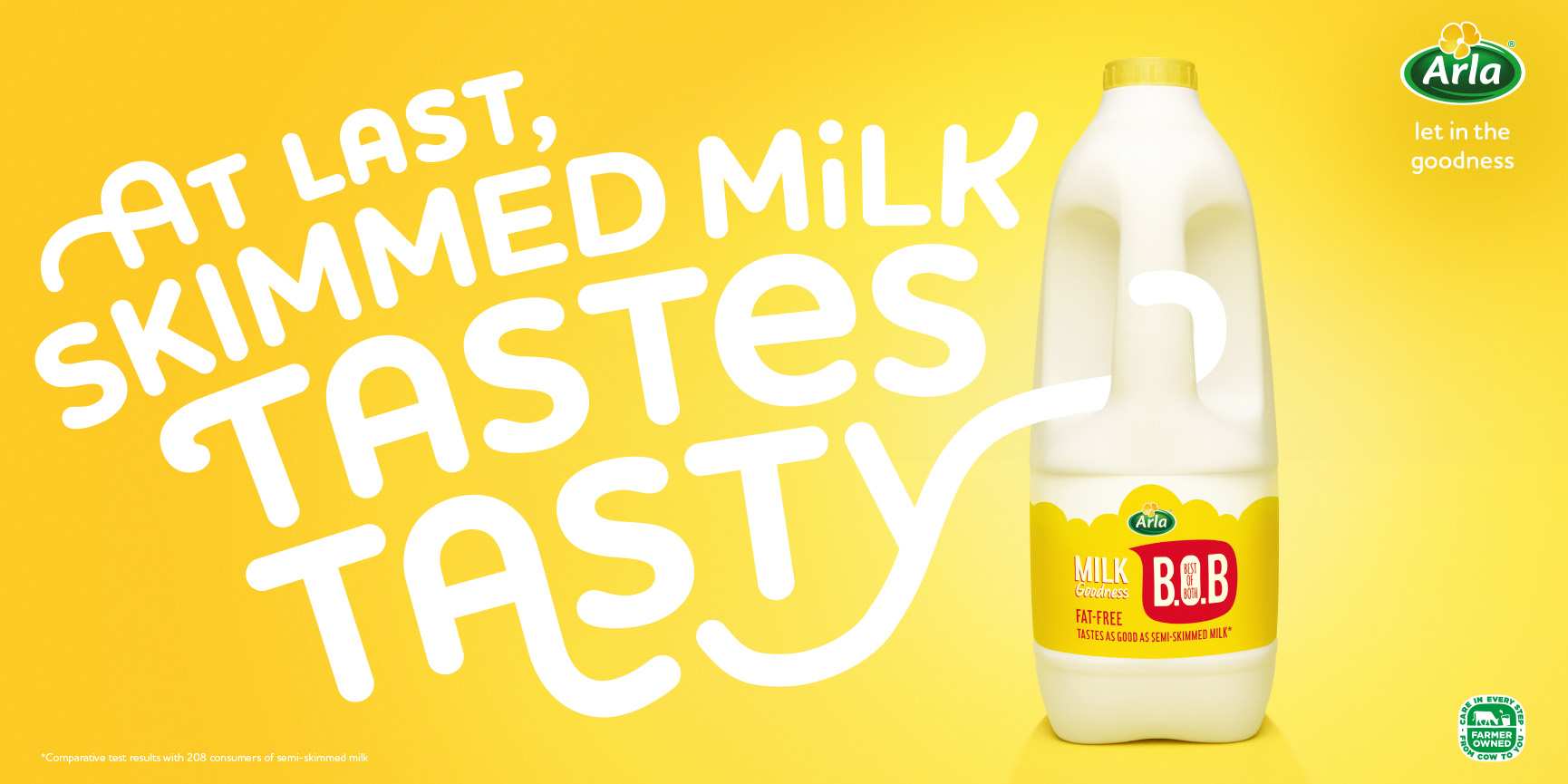
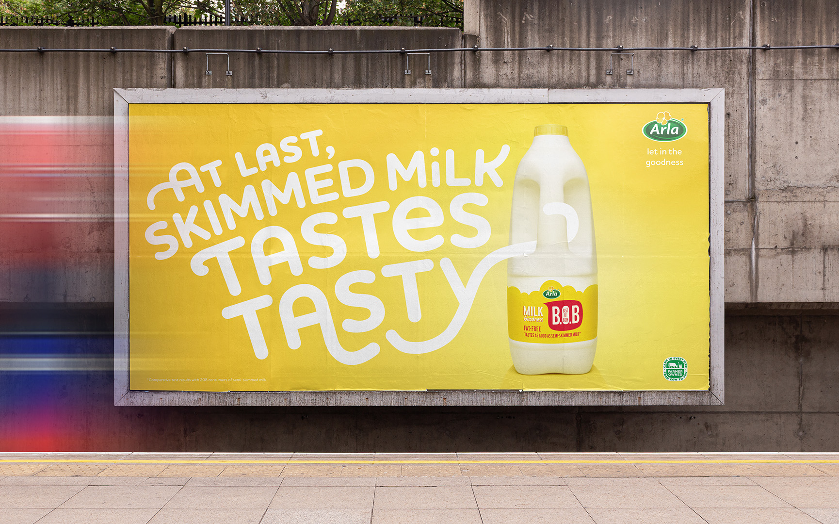
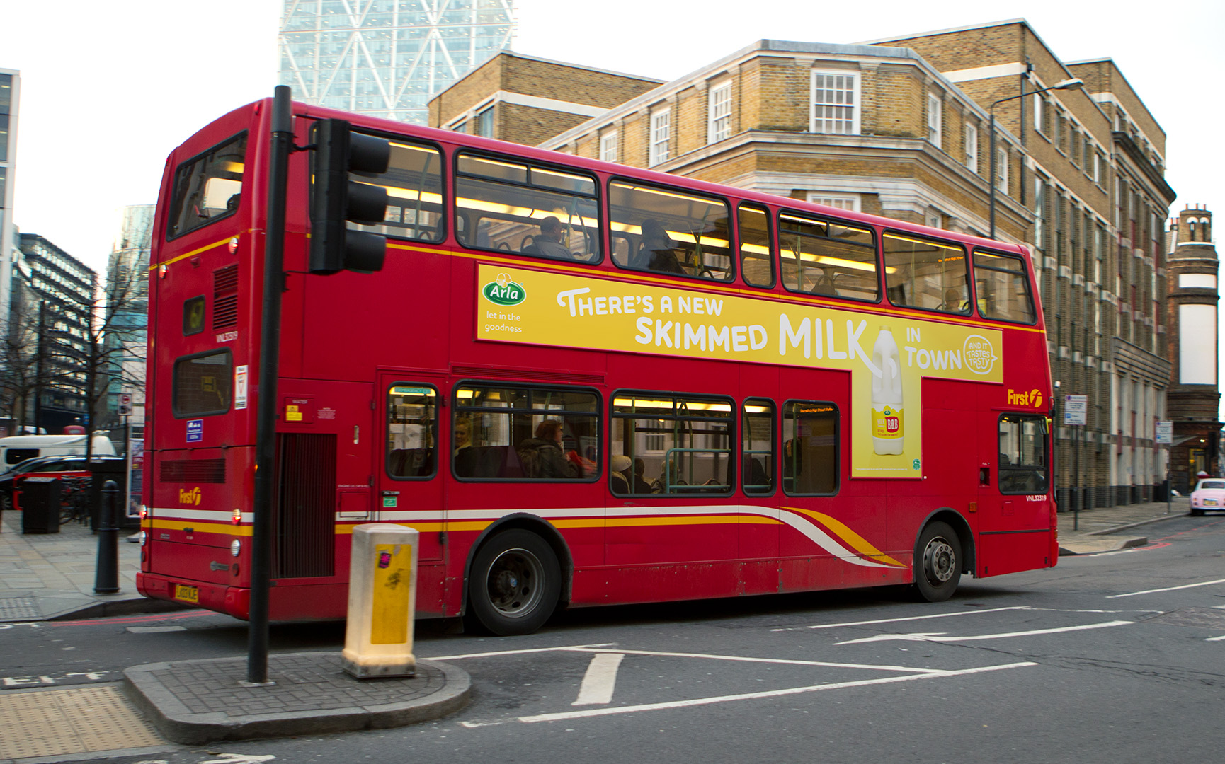
Landscape Layout
Only one landscape layout was created and has the same methodology as the 6 Sheet Posters.
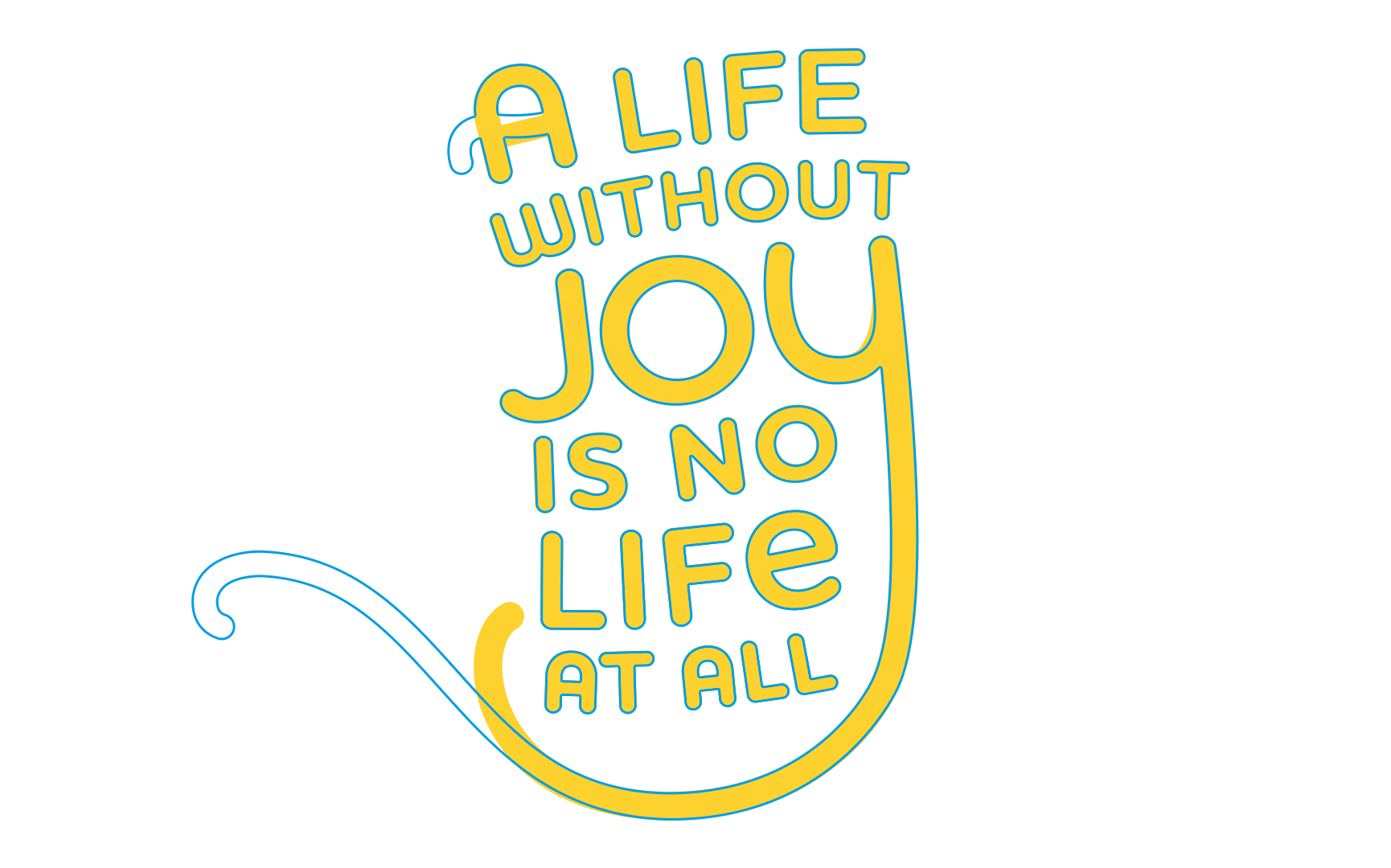
The Type
Here are some additional examples of how the type interacts with the bottle.