modern life
"What if everything was this simple?"
Taylors have been making great coffee for nearly 150 years, but the coffee market has become overly complicated.
Taylors mission is to save coffee lovers from confusion and from having to compromise on quality or taste. So they have been creating products to do just that.
Taylors launched a brand-new range of coffees designed to appeal to people who want good coffee without any fuss.
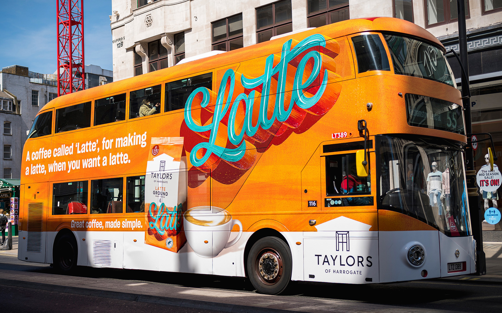
All the coffees have been especially blended for the way you drink it and are simply called Latte, Espresso and Cafetière - names designed to clearly tell people exactly what they are for. Our campaign celebrates this and has fun with the question, ’What if everything was this simple?’
Great Coffee, Made Simple TVC
The new coffees are simply called Latte, Espresso and Cafetière, names designed to tell the consumer in plain language, exactly what they’re for.
All of the coffees have been especially blended for the way you drink them. For example, the "Latte" coffee has been especially made to have a punchy flavour that cuts through lashings of milk, whereas “Cafetière” has been designed with a coarse grind size in mind and a balanced flavour which is great for everyday drinking.
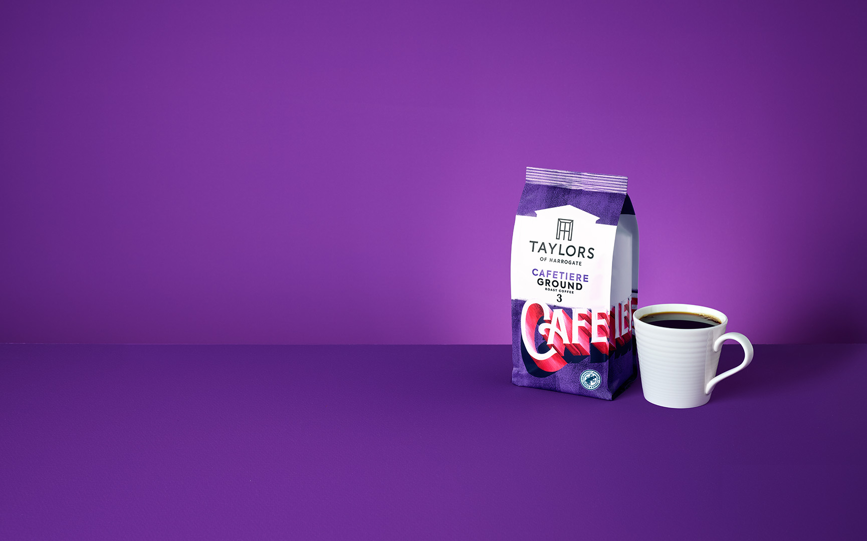
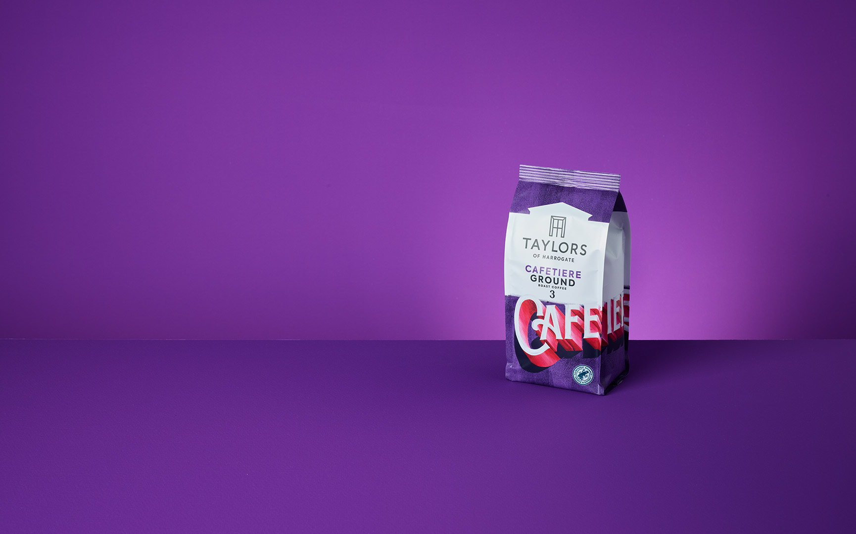
Cafetière Master Image
Multiple shots of these packs were taken with and without the cup. The background required a level of cleaning and vibrance added. Along with the cafetière the packaging itself needed a level of clarity so that the branding didn't appear washed out.
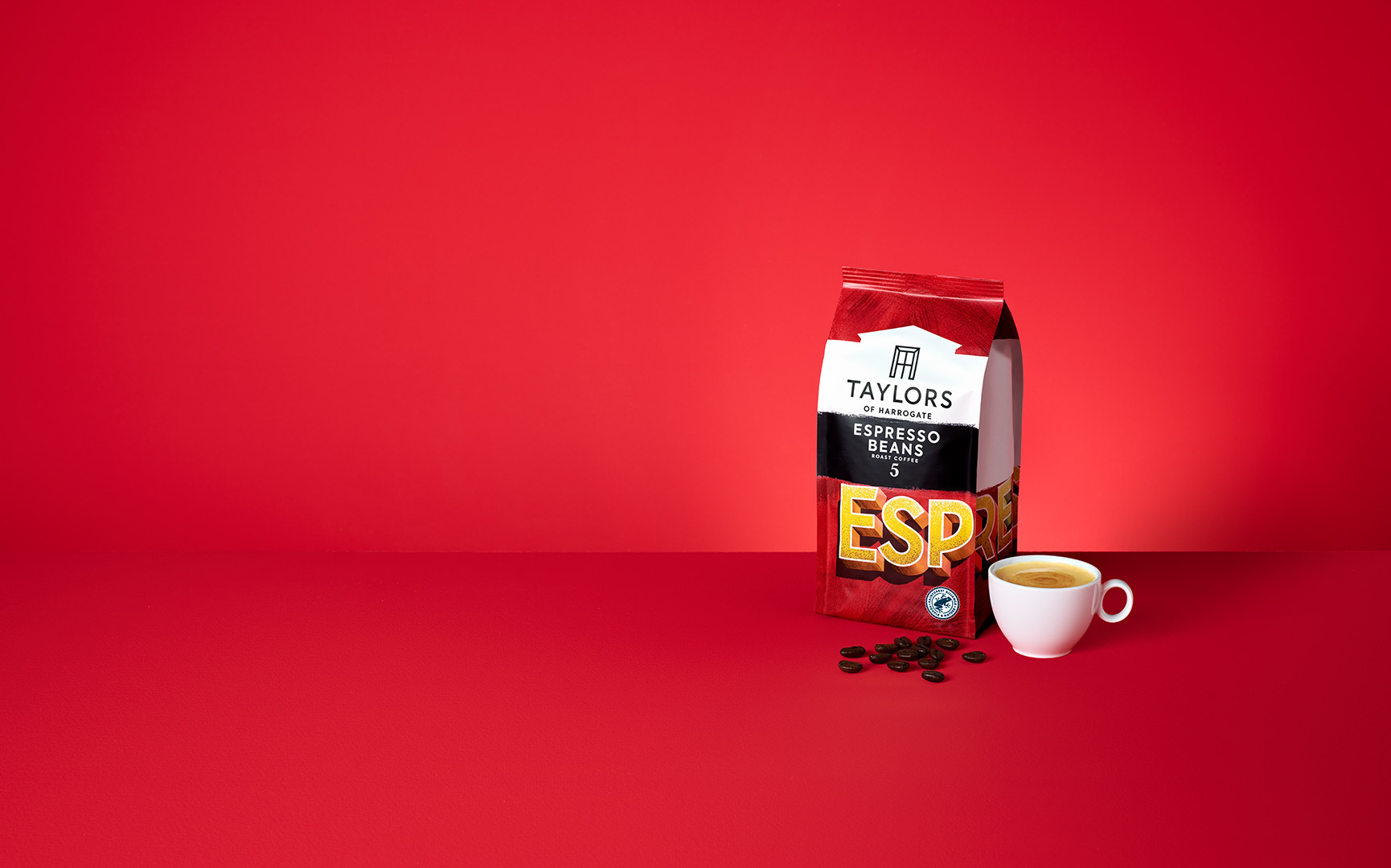

Espresso Beans Master Image
Multiple shots of these packs were taken with and without the cup along with the espresso beans. The background required a level of cleaning and vibrance added. Along with the beans the packaging itself needed to be amended as no shots of espresso beans pack had been taken so the espresso ground pack was used.
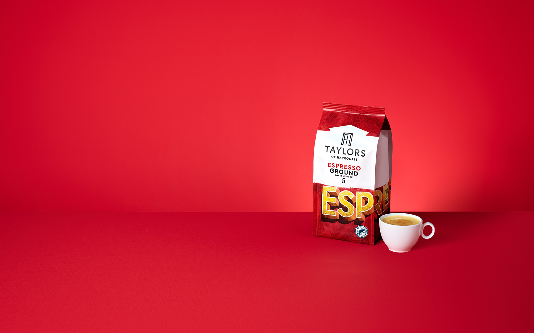
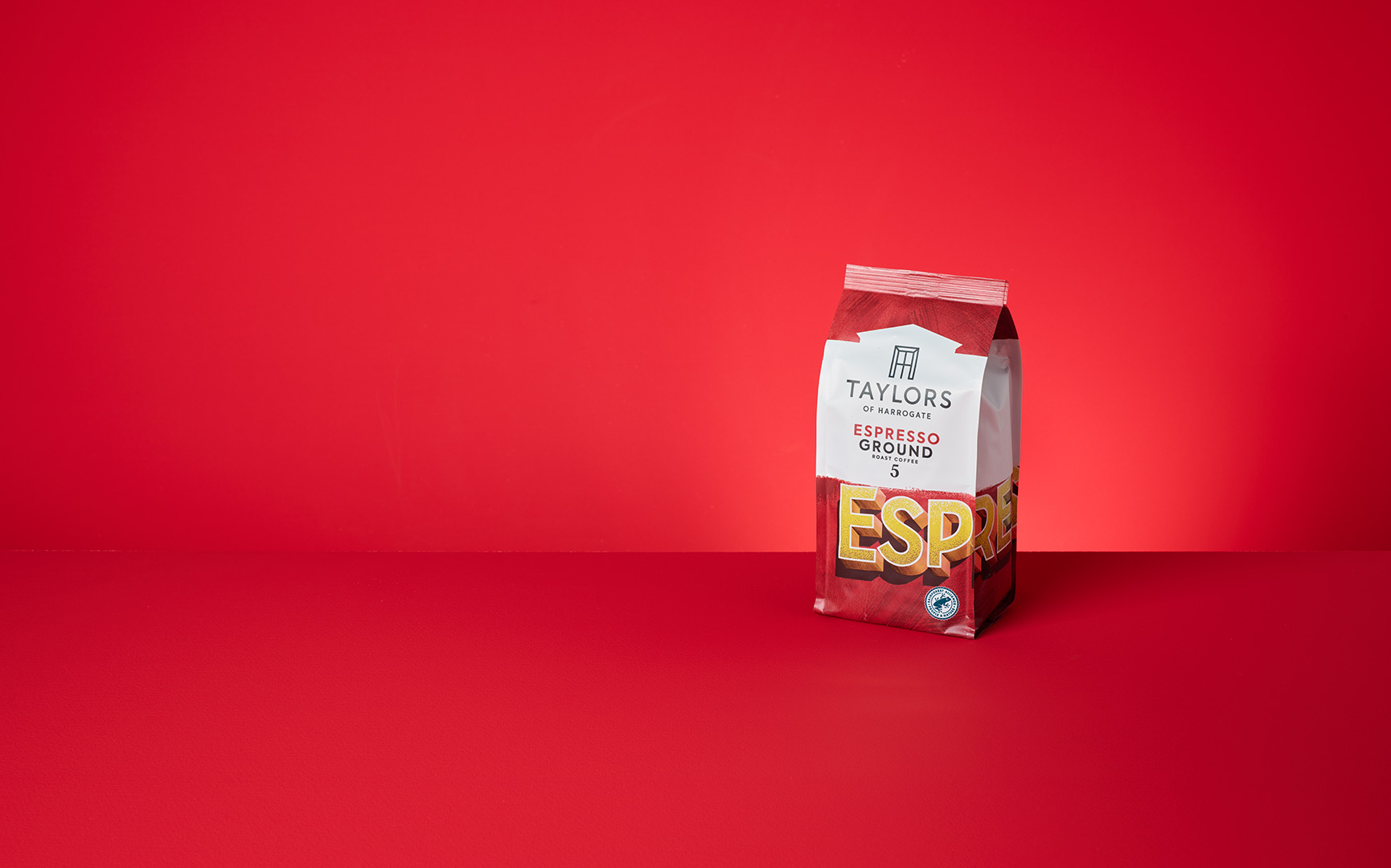
Espresso Ground Master Image
Multiple shots of these packs were taken with and without the cup. The background required a level of cleaning and vibrance added. The packaging itself needed a level of clarity so that the branding didn't appear washed out.
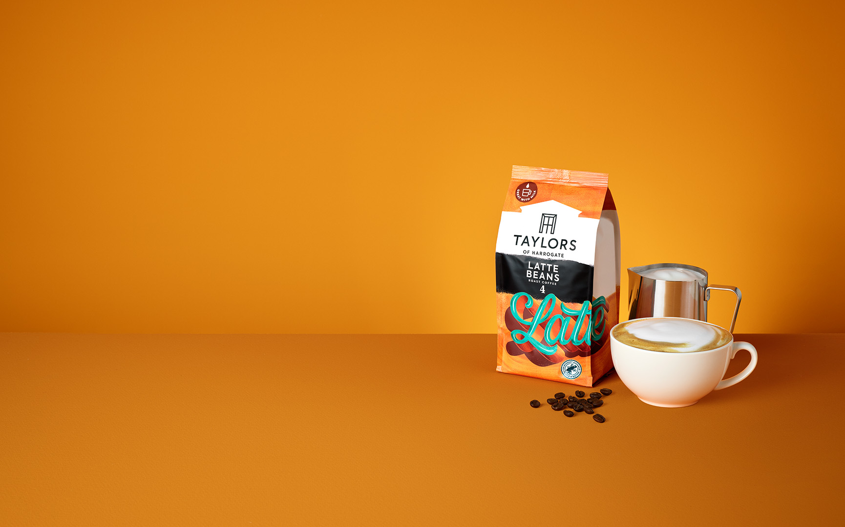

Latte Beans Master Image
No shots of the Latte Beans pack were taken. So in this instance the Latte Ground pack was used and the pack was then amended to the Latte Beans Pack. The background required a level of cleaning and vibrance added.
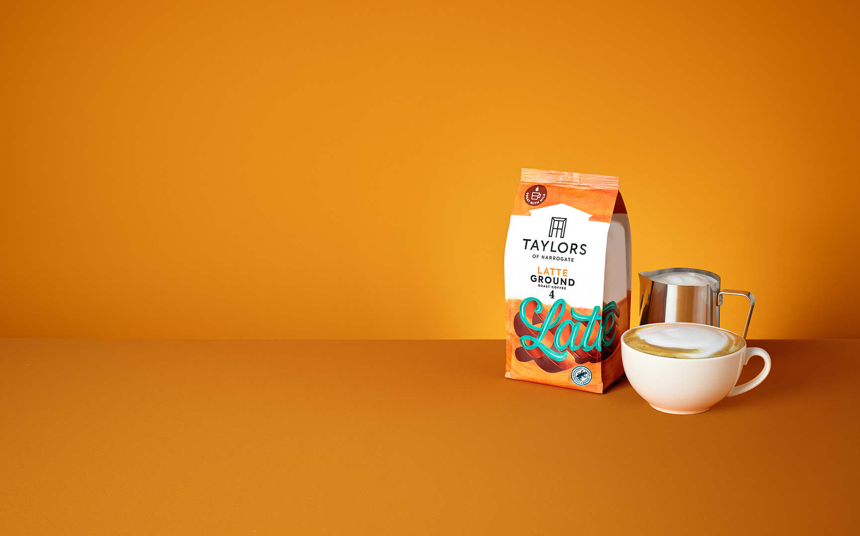
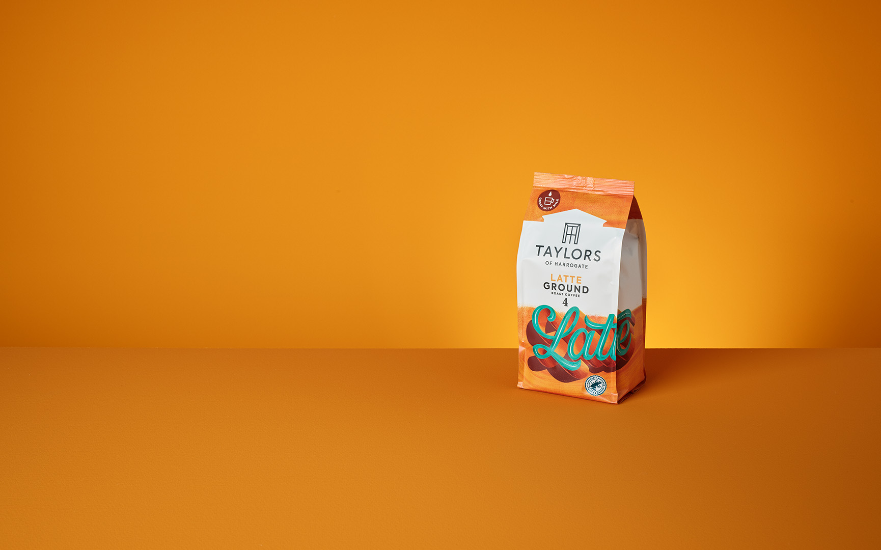
Latte Ground Master Image
Multiple shots of these packs were taken with and without the cup. The background required a level of cleaning and vibrance added. Along with that the packaging itself needed a level of clarity so that the branding didn't appear washed out.
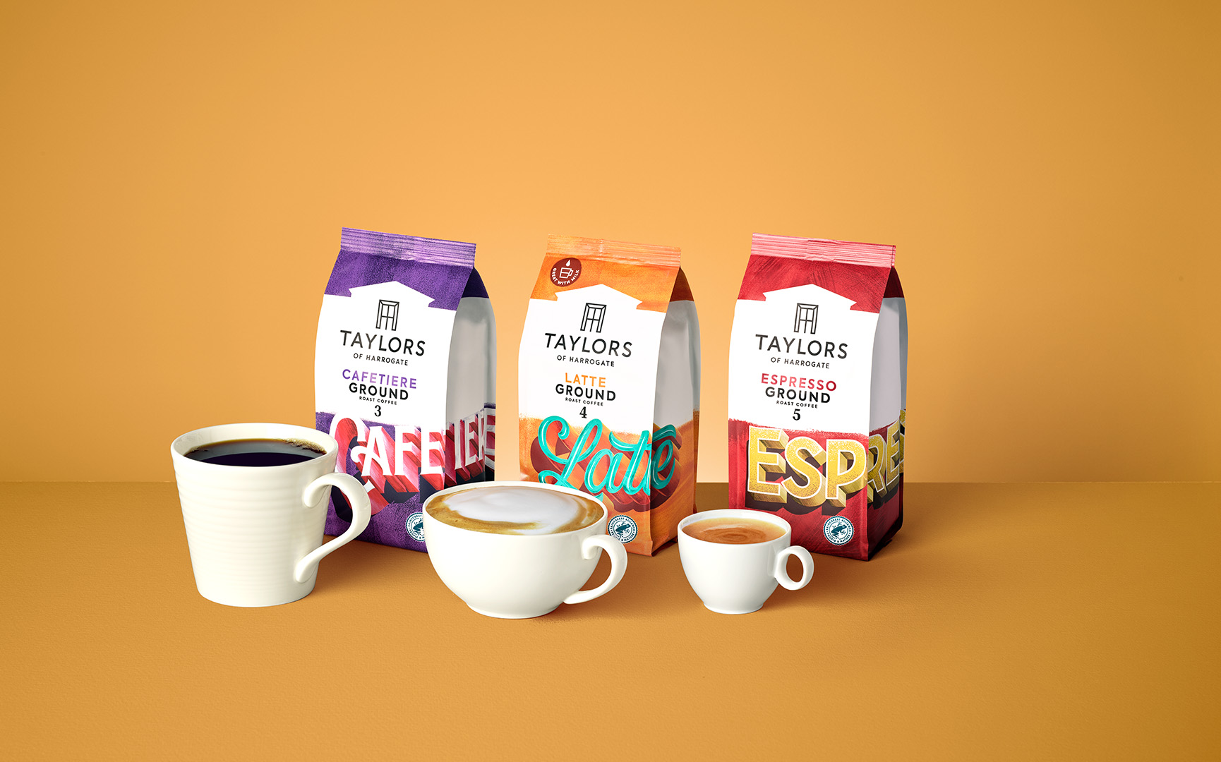
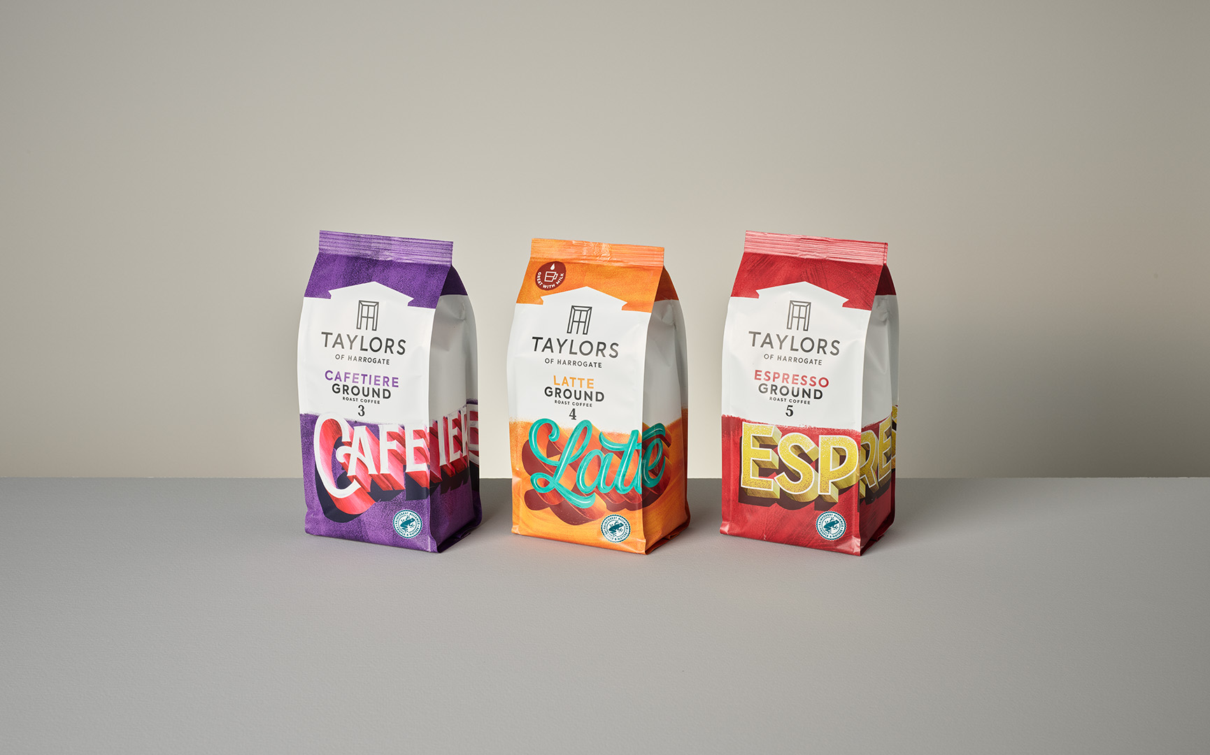
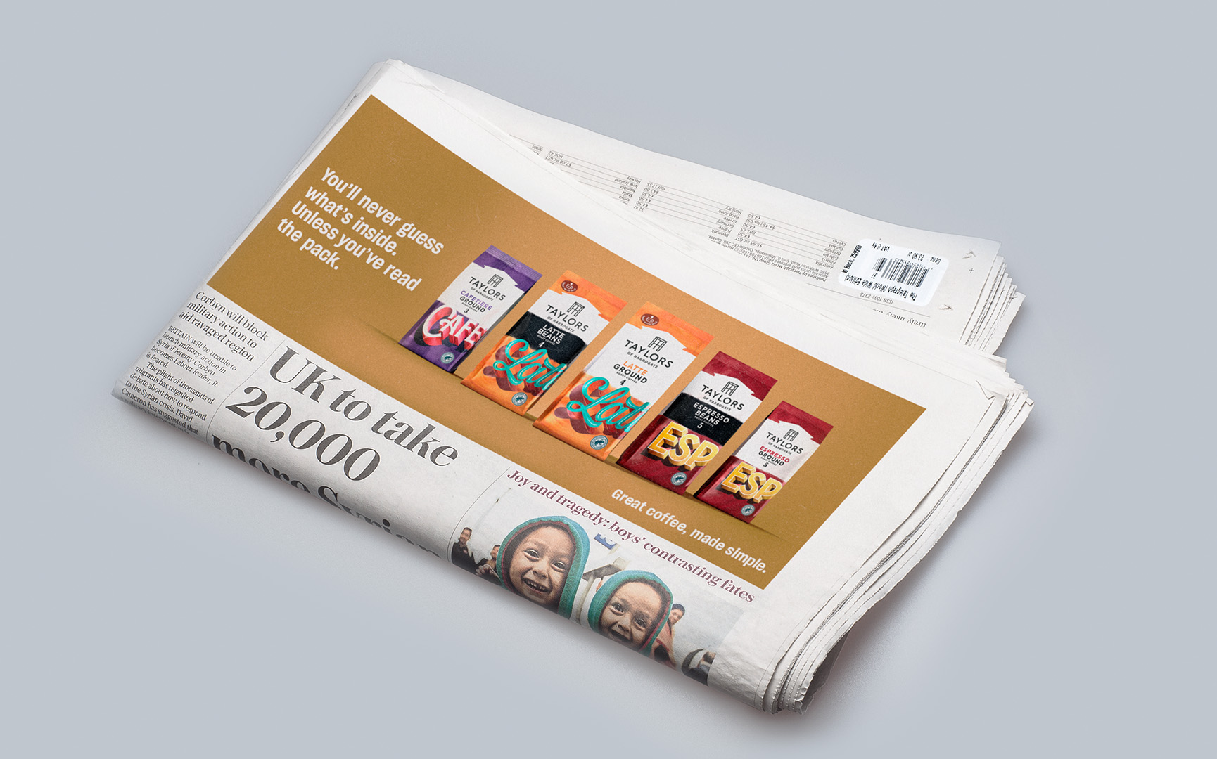
Range Master Image
The whole range shot required a great level of retouching. Including straightening of the packs, pack clean up and adding vibrance to each pack so they didn't look washed out.
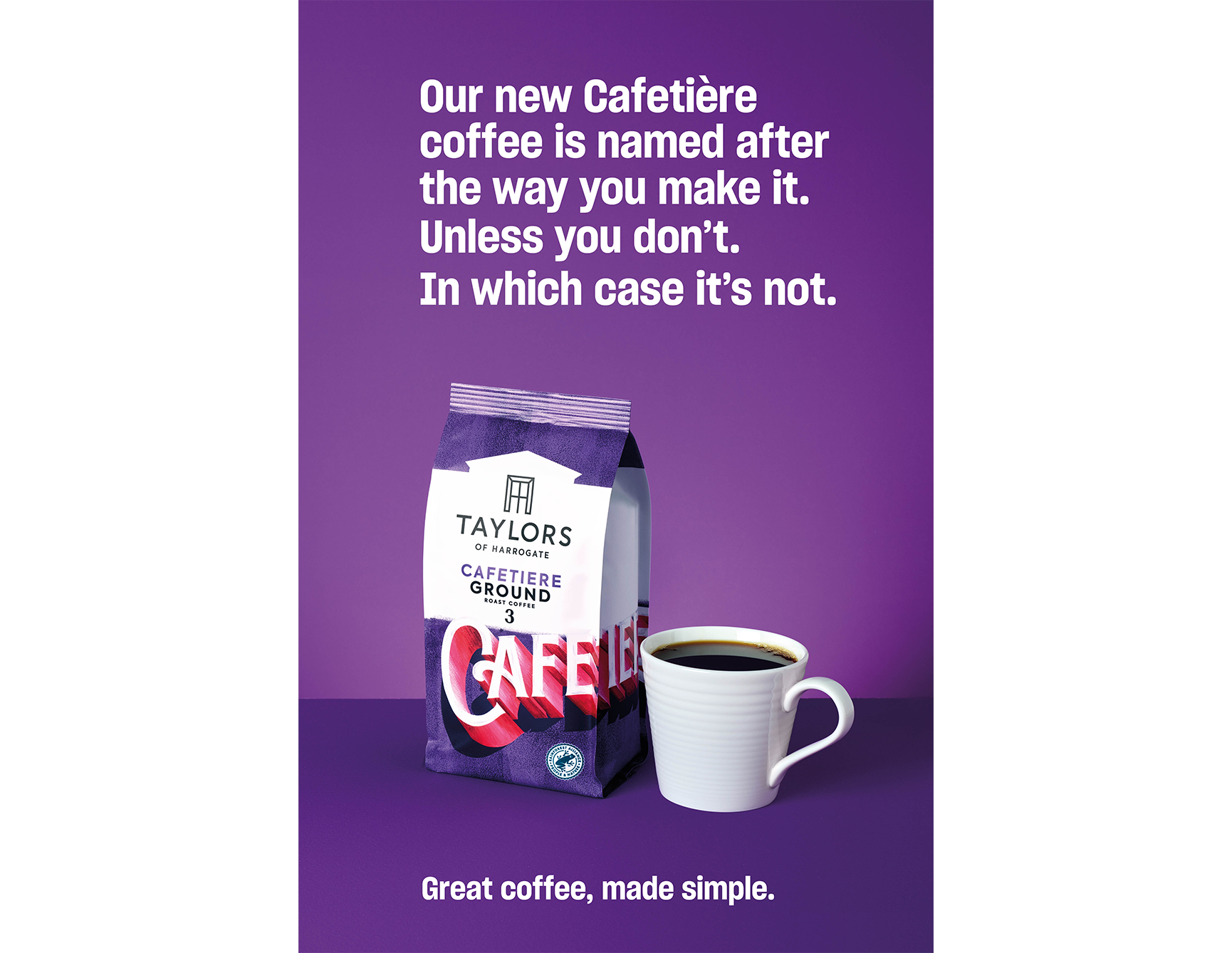
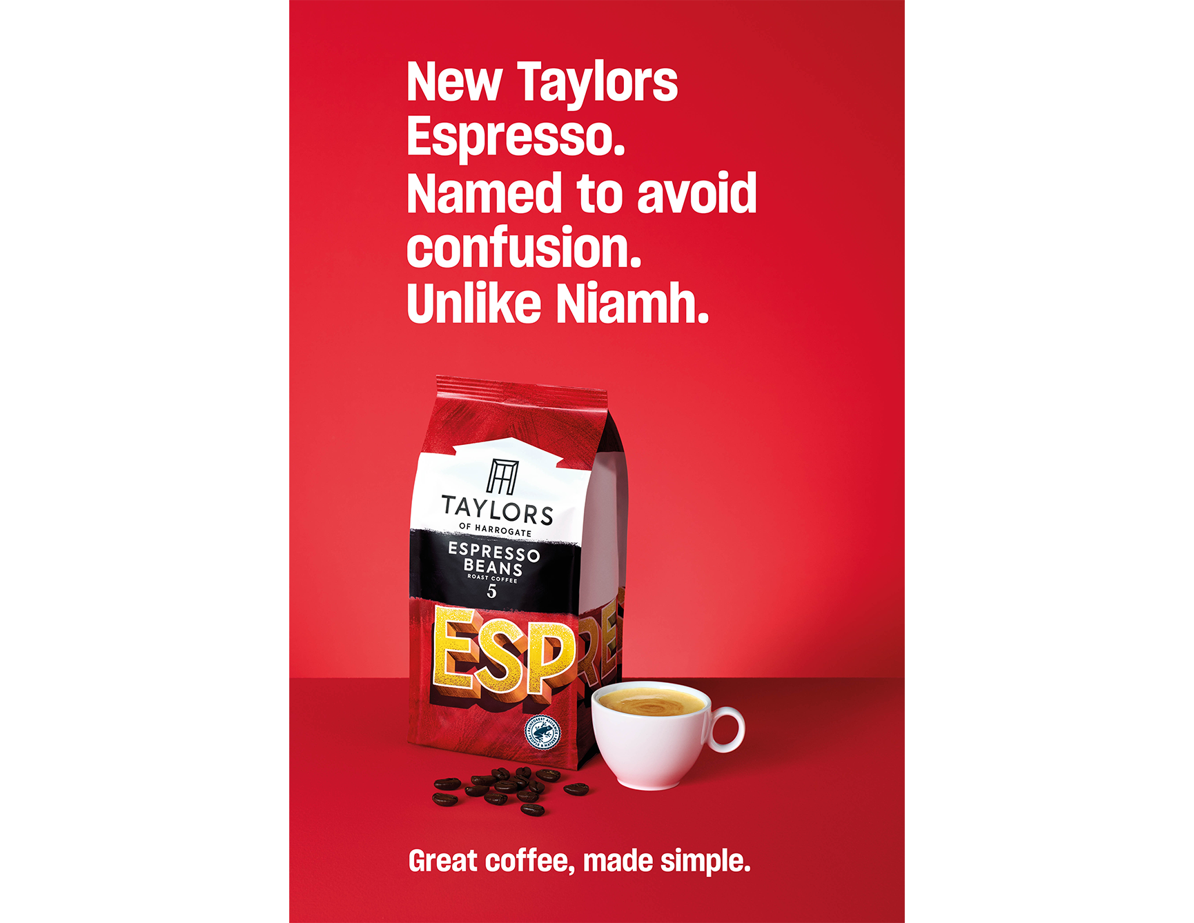
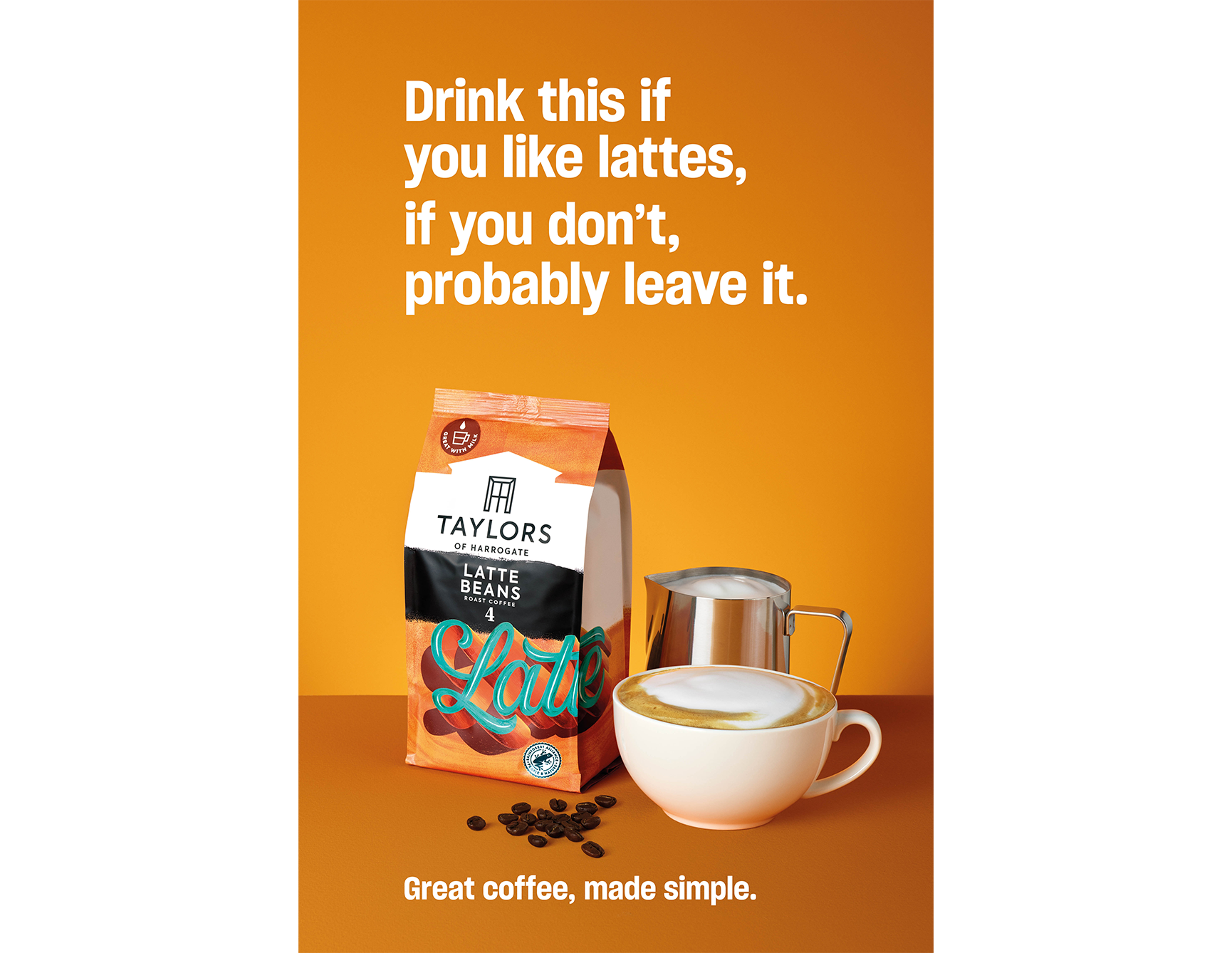
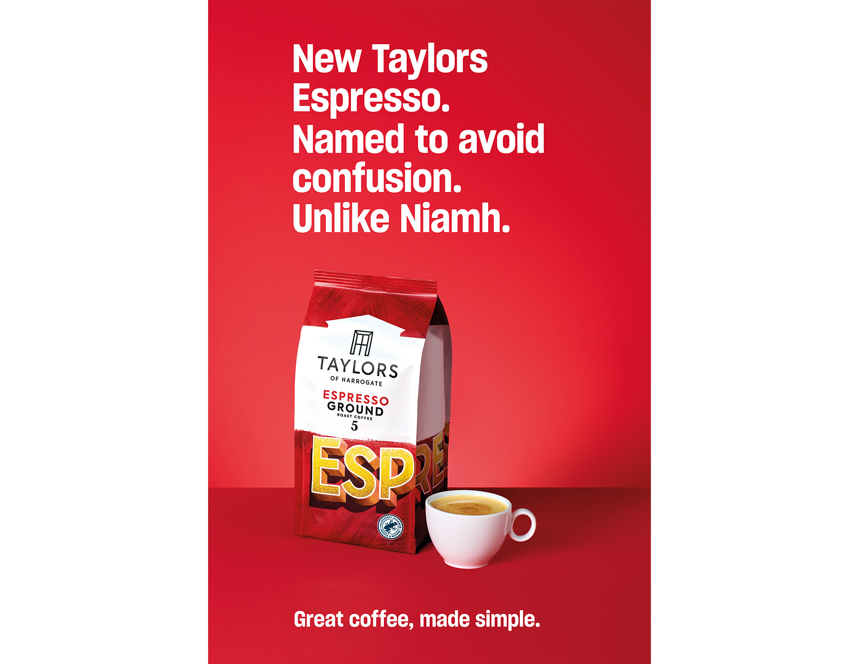
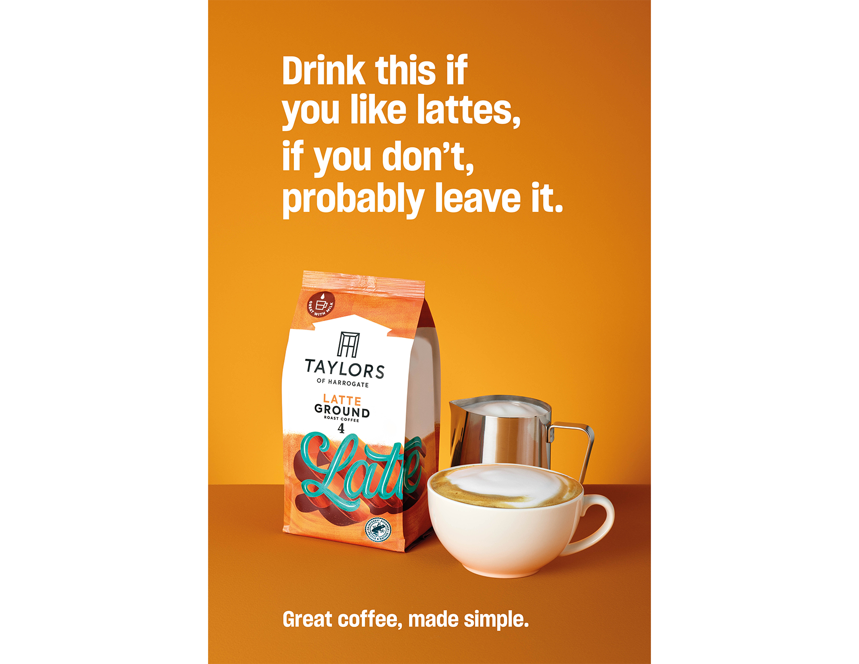
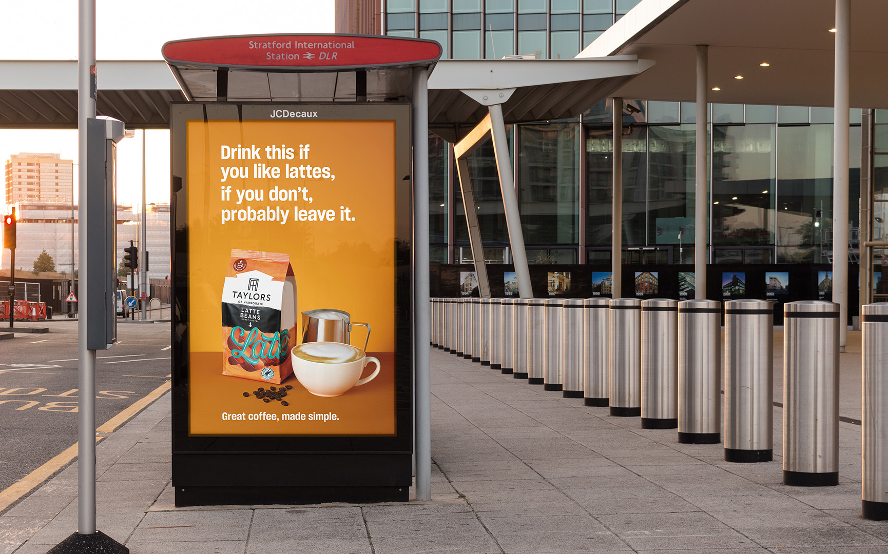
Portrait Layouts
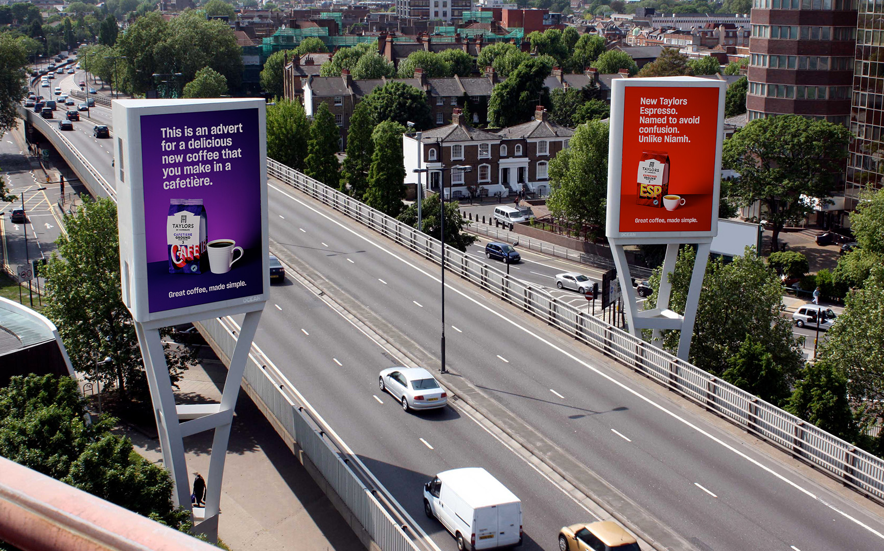
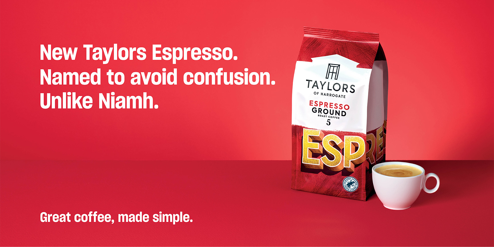
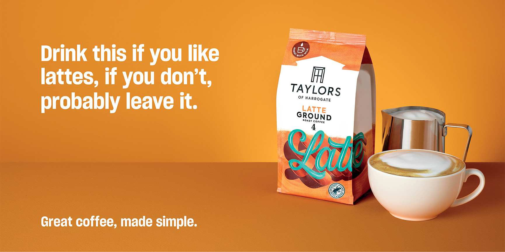
These master shots were then used to create a range of portrait layouts for print and digital. Using the vibrant colour scheme and type layout these created an eye-catching campaign.
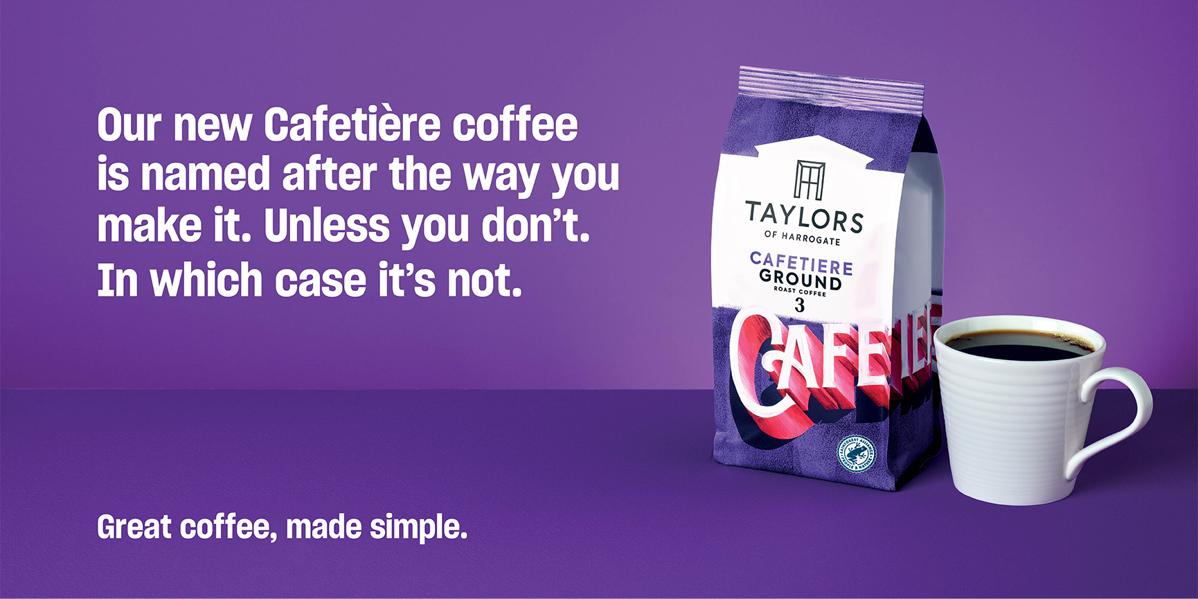
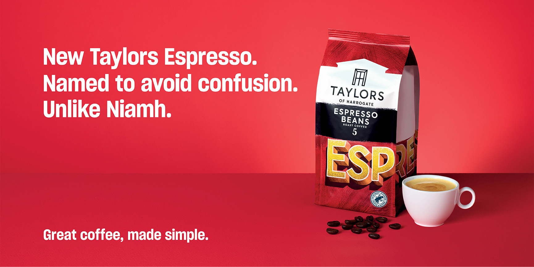
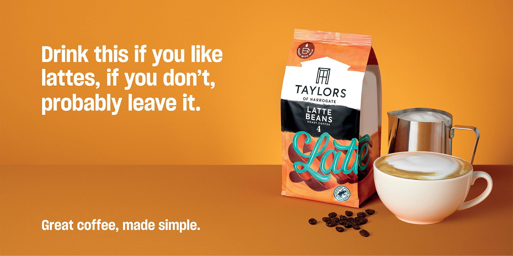
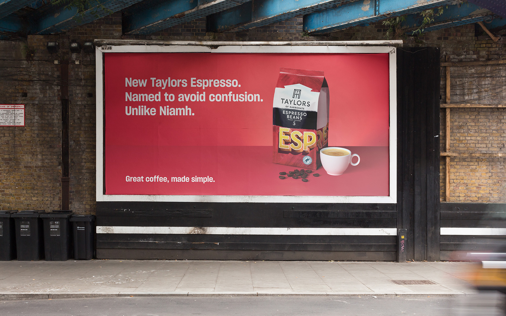
Landscape Layouts
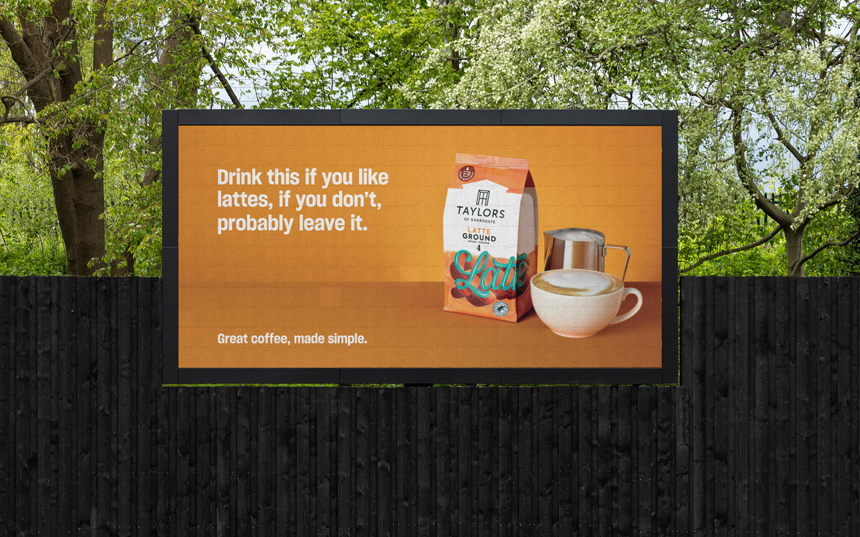
These master shots were then used to create a range of landscape layouts for print and digital. Using the vibrant colour scheme and type layout these created an eye-catching campaign.
